
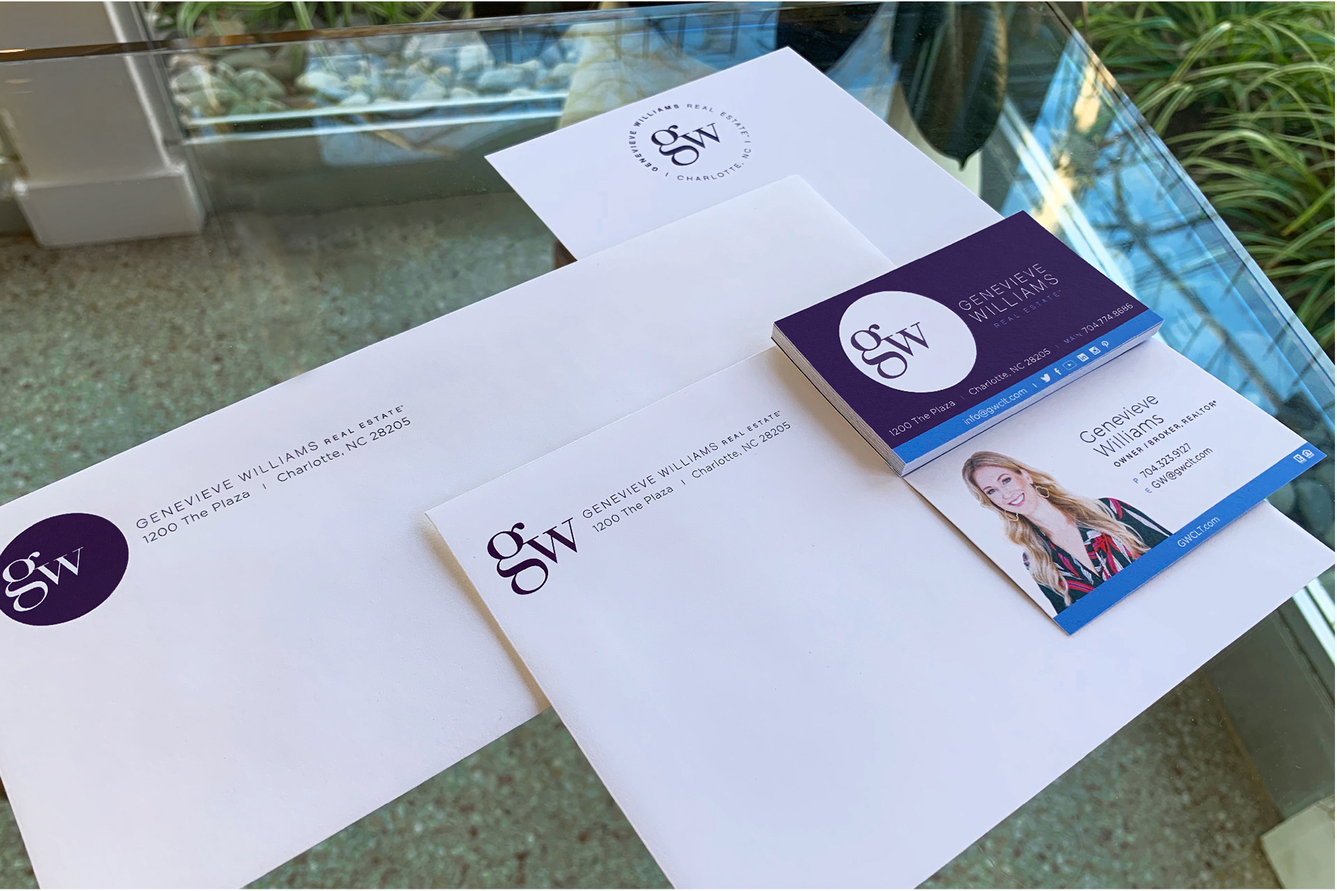
The stationery system shows the adaptability of the logo.
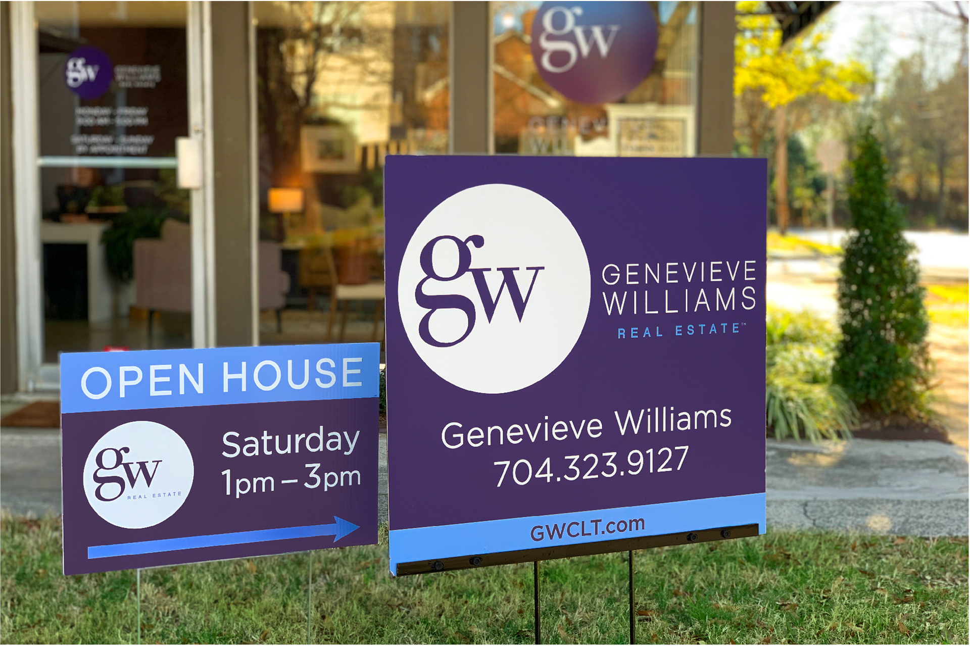
The most important piece of the initial branding was her yard sign - it needed to stand out against the busy backdrop of houses, yards, and apartments, while conveying her brand at a glance. The white circle draws eyes right to the sign.
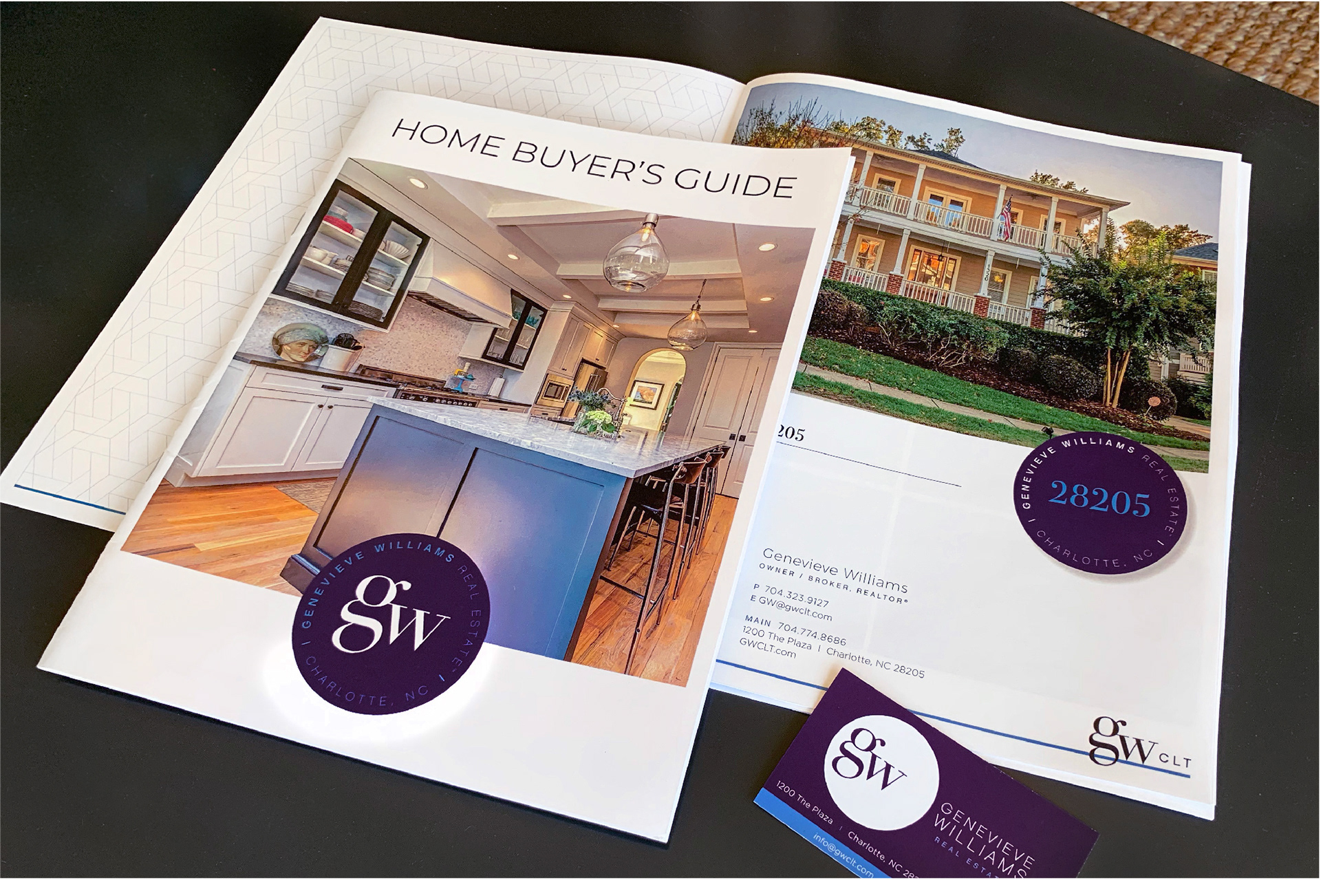
I created a set of templates for the new firm's marketing director to be able to easily create listing, property, and buyer's guides. A custom pattern appears on the inside covers.

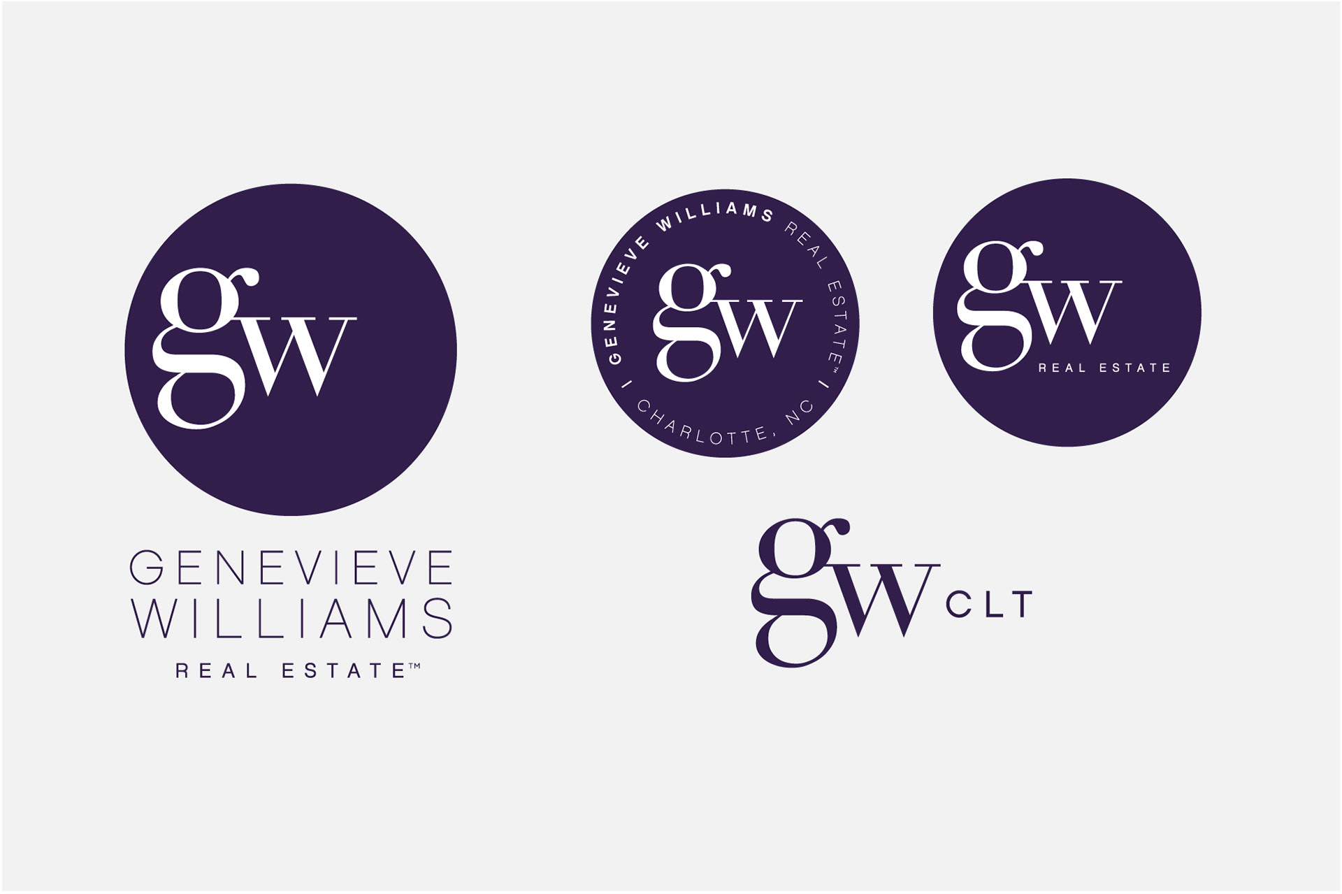
I also created a full set of local zip code logos to match her brand logo. The zip code logos are used on promotional material and serve as an extra layer of branding, while instilling a sense of pride in the area being promoted.

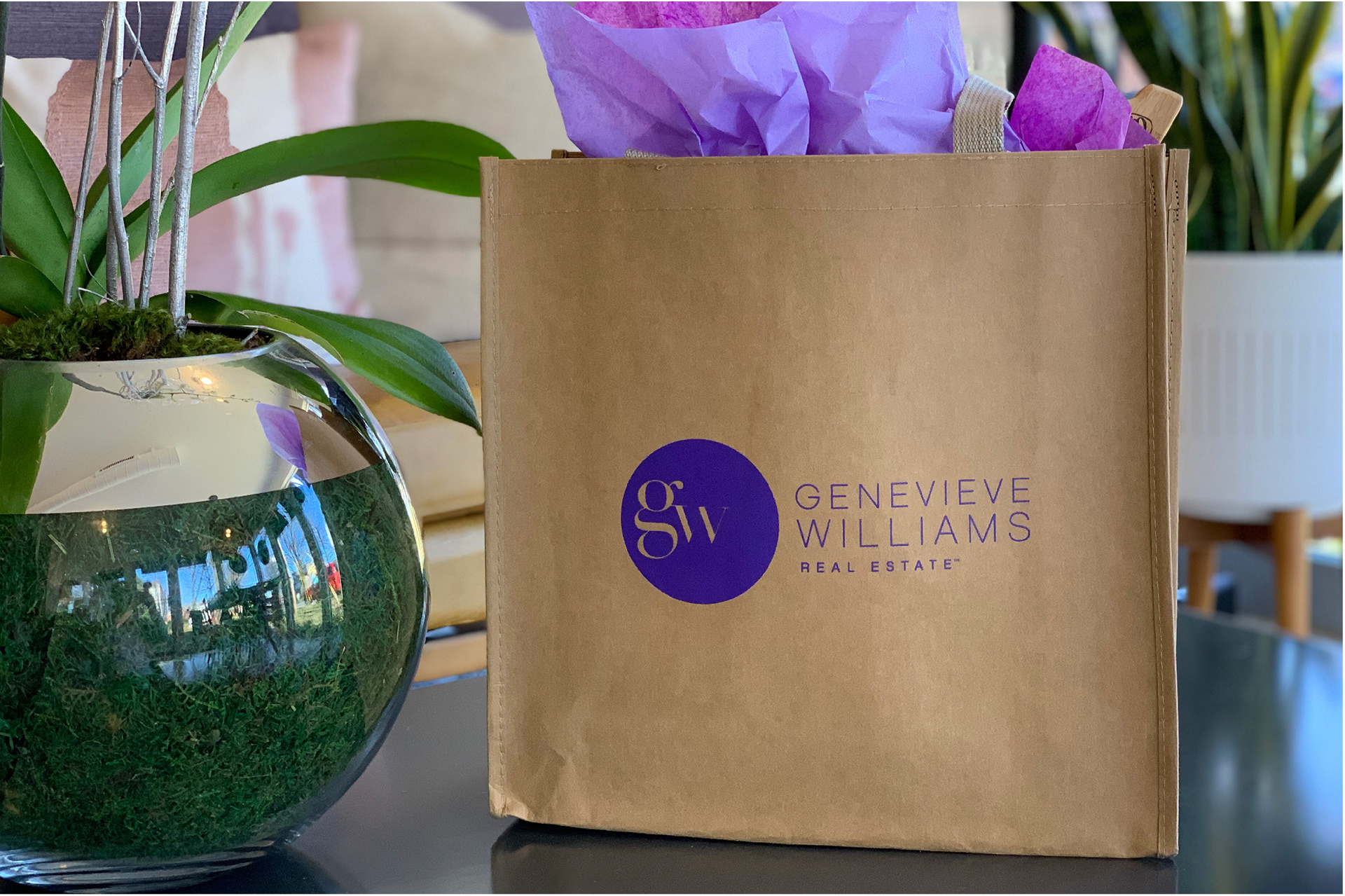
The promotional material was carefully chosen for excellent quality and the ability to stand out amongst a sea of other real estate swag - and look great with the new logos.